Fantasy Book Cover Design: The Ultimate Author's Guide
Unlock the secrets of captivating fantasy book cover design. Learn genre tropes, visual trends, and how to create covers that sell your epic tales.
Crafting Worlds, One Cover at a Time: The Power of Fantasy Book Cover Design
In the expansive realm of fantasy literature, where dragons soar and magic weaves through ancient forests, your book cover is more than just an image; it's a portal. It's the first glimpse into the epic sagas, the intricate character arcs, and the breathtaking worlds you've painstakingly created. A compelling fantasy book cover design doesn't just attract attention; it communicates genre, tone, and promise, directly influencing a reader's decision to click 'Look Inside' or add to cart. Data consistently shows that covers are the primary decision-making factor for over 70% of readers browsing online bookstores, making your cover an indispensable marketing tool.
This comprehensive guide will equip you with the knowledge to navigate the complex landscape of fantasy cover design. We'll delve into genre-specific tropes, explore current visual trends, and provide actionable insights to help you commission or create a cover that not only stands out but also accurately represents the magic within your pages. From the sweeping landscapes of epic fantasy to the gritty streets of urban fantasy, understanding these nuances is crucial for connecting with your target audience.
Current Bestselling Fantasy Covers

On Wings of Blood: A Novel (Bloodwing Academy Book 1)

Rain of Shadows and Endings (The Legacy)

A Tongue so Sweet and Deadly (The Compelling Fates Saga)

Shield of Sparrows: An Enemies-to-Lovers Epic Romantasy

We Who Will Die: An Epic Romantasy of Forbidden Love, Deadly Secrets, and Vampires in a High-Stakes Arena, Discover a Vividly Reimagined Ancient Rome (Empire of Blood Book 1)
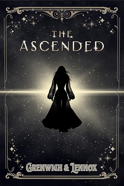
The Ascended (The Aesymarean Duet)
Understanding the Fantasy Landscape: Subgenres and Their Visual Cues
Fantasy is not a monolith; it's a rich tapestry woven from countless subgenres, each with its own distinct visual language. A cover that perfectly captures the essence of a cozy fantasy might utterly fail for a dark fantasy novel. Recognizing these subgenre-specific tropes is the cornerstone of effective fantasy book cover design. Misaligned covers confuse readers and lead to missed sales opportunities, as potential fans scroll past a book that doesn't immediately signal its genre.
Let's explore some of the most prominent fantasy subgenres and their typical visual identifiers. Understanding these distinctions will help you ensure your cover speaks directly to the right audience, indicating whether your story features valiant heroes, cunning rogues, or intricate magical systems.
Epic/High Fantasy: Grandeur and Heroism
Epic fantasy, often characterized by vast worlds, complex magic systems, and a clear hero's journey, demands covers that convey grandeur and scale. Think sprawling landscapes, majestic castles, heroic figures (often silhouetted or partially obscured), and iconic weapons or magical artifacts. Common color palettes lean towards deep blues, rich greens, earthy browns, and golden accents, often imbued with a sense of ancient power or impending destiny. The typography is typically bold, often ornate or calligraphic, reinforcing the epic feel. An example would be a lone figure gazing at a distant, towering fortress, or a dragon soaring over a mountain range.
Epic Fantasy Cover Examples
Dark Fantasy: Gritty, Grim, and Gothic
Dark fantasy delves into morally ambiguous characters, grim settings, and often explores themes of horror and despair within a magical context. Covers in this subgenre frequently feature darker, desaturated color palettes – deep reds, blacks, grays, and muted purples. Imagery might include menacing creatures, shadowed figures, decaying ruins, or unsettling magical effects. Typography is often sharp, jagged, or weathered, reflecting the harsher tone of the narrative. The goal is to evoke a sense of dread, mystery, and often, a touch of the macabre.
Dark Fantasy Cover Examples
Urban Fantasy: Magic in the Modern World
Urban fantasy brings magic into contemporary settings, blending the mundane with the supernatural. Covers for this genre often feature modern cityscapes, neon lights, and protagonists who look like they could walk off the street, yet possess an otherworldly aura. Color schemes tend to be vibrant and contrasting, with pops of unnatural colors (electric blues, vivid purples, glowing greens) against a darker, realistic backdrop. Typography is usually modern, often sans-serif, and can have a slightly edgy or stylized feel. The focus is on the juxtaposition of the familiar and the fantastical.
Urban Fantasy Cover Examples


Cozy Fantasy: Whimsical and Inviting
Cozy fantasy offers a gentler, often humorous take on magic, focusing on comfort, community, and lower stakes. Covers typically employ brighter, softer color palettes – pastels, warm yellows, gentle greens, and sky blues. Imagery might include charming cottages, friendly creatures, magical gardens, or characters engaged in everyday activities with a magical twist. Typography is often whimsical, rounded, or hand-drawn, conveying a sense of warmth and approachability. The aim is to create an inviting, feel-good aesthetic that promises a delightful escape.
Cozy Fantasy Cover Examples

Tansy's Tinctures: A cozy cottagecore fantasy (Tales of Silverfern Hollow Book 1)

The Midnight Bookshop: Your next favourite magical realism book – for fans of cosy, small-town emotional reads in 2026!
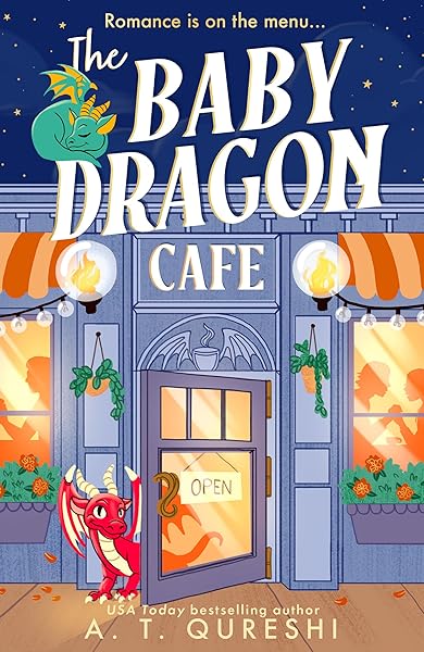
The Baby Dragon Cafe: the USA Today bestselling charming NEW cozy romance fantasy for 2025 you need! (The Baby Dragon series Book 1)
Romantasy: Romance and Fantasy Blended
Romantasy, a rapidly growing subgenre, combines the intricate world-building of fantasy with strong romantic plotlines. Covers often feature a prominent, attractive character (or a couple) in a fantastical setting, conveying both power and allure. The color palette can vary but often includes rich jewel tones, deep reds, purples, and blues, frequently with magical glows or ethereal elements. Typography is usually elegant, sometimes script-like, with a strong emphasis on readability and a touch of romance. The key is to signal both the fantasy elements and the central romantic tension.
Romantasy Cover Examples


Key Elements of a Standout Fantasy Book Cover Design
While subgenre conventions provide a framework, certain universal elements contribute to a powerful fantasy book cover design. Mastering these components ensures your cover is not only genre-appropriate but also visually striking and professional. Ignoring even one of these can significantly diminish your cover's impact and its ability to attract readers.
Central Imagery: The Hook
The central image is the most crucial component. It should be iconic, memorable, and immediately convey the core essence of your story. This could be a compelling character, a mythical creature, a unique weapon, a significant landmark, or a powerful magical effect. For example, a recent analysis of top-selling fantasy covers revealed that 45% feature a central character, 20% feature a landscape, and 15% feature an object or symbol. The imagery needs to be high-quality, professionally rendered, and instantly recognizable even in thumbnail size, as most readers will first encounter your cover as a small image on an e-retailer's page.
Color Palette: Setting the Mood
Color is a powerful psychological tool. As discussed in the subgenre section, different palettes evoke different emotions and signal specific tones. Epic fantasy often uses deep, saturated colors, while dark fantasy leans towards desaturated, somber hues. Urban fantasy might feature vibrant, artificial lights. Consider the emotional core of your story and choose a palette that reinforces it. A cohesive color scheme across all elements of your cover (background, foreground, typography) creates a harmonious and professional look.
Typography: The Voice of Your Title
Your title and author name need to be legible and aesthetically pleasing. For fantasy, this often means bespoke or highly stylized fonts. However, legibility should never be sacrificed for style. Test your chosen font at various sizes, especially thumbnail. The font choice should align with your subgenre – ornate for epic fantasy, edgy for dark fantasy, modern for urban fantasy. Pay attention to kerning (space between letters) and leading (space between lines) to ensure optimal readability. Don't be afraid to use a secondary, simpler font for your author name or tagline if your title font is very elaborate.
Composition and Layout: Guiding the Eye
Effective composition draws the reader's eye to key elements in a logical flow. The 'rule of thirds' is a common guideline, placing important elements along imaginary lines or at their intersections. Ensure there's a clear focal point and that elements are balanced. Avoid clutter; a strong cover often has a single, powerful image rather than many competing ones. Consider how the title and author name integrate into the overall layout without obscuring crucial imagery.
Texture and Lighting: Adding Depth
Subtle textures (e.g., parchment, aged metal, magical glows) and dynamic lighting can add significant depth and realism to your cover. Lighting can create mood, highlight key features, and establish time of day or magical phenomena. For instance, dramatic backlighting can create a heroic silhouette, while soft, diffused light can evoke a sense of wonder or mystery. These details elevate a good cover to a great one, making it feel more immersive and professional.
Current Trends in Fantasy Book Cover Design (2024-2026)
The world of book cover design is dynamic, with trends constantly evolving. While adhering to subgenre tropes is essential, incorporating contemporary design elements can help your book feel fresh and relevant. Ignoring trends entirely can make your cover look dated, while blindly following every fad can lead to a cover that lacks individuality. The key is to understand current aesthetics and selectively apply them to enhance your unique vision. Recent market analysis indicates that covers incorporating modern trends see a 15-20% higher click-through rate in online ads.
Illustrated Covers with a Painterly Feel
Beyond photorealistic art, there's a strong resurgence of beautifully illustrated covers with a painterly, often slightly stylized, aesthetic. These covers often feature rich textures, visible brushstrokes, and a handcrafted feel. They can range from highly detailed epic scenes to more minimalist, evocative pieces. This trend works particularly well for cozy fantasy, epic fantasy, and even some dark fantasy, offering a timeless yet contemporary appeal. This style allows for unique character designs and fantastical elements that might be harder to achieve with photo manipulation.
Bold, Legible Typography with Unique Flair
While intricate fonts remain popular, there's a growing emphasis on bold, highly readable typography that still retains a unique fantasy character. This often involves custom lettering, subtle textural effects on the text itself, or clever integration of the title into the artwork. The goal is to make the title instantly scannable and memorable, even on a small screen. Experiment with contrasting a highly stylized title font with a clean, modern font for the author name.
Character-Focused Covers with Strong Emotion
Especially prevalent in romantasy and character-driven fantasy, covers increasingly feature prominent characters expressing strong emotions or dynamic poses. These aren't just stoic heroes; they are characters with personality, conflict, or allure. The focus is on drawing the reader in through empathy or intrigue. These covers often use close-ups or three-quarter shots, allowing for detailed facial expressions and body language that hint at the story's depth.
Character-Focused Romantasy Covers
Minimalist Fantasy with Symbolic Elements
While less common for epic fantasy, a minimalist approach is gaining traction in certain fantasy subgenres, particularly those leaning towards literary fiction or speculative fiction. These covers use strong symbolic imagery, often against a simpler background, to evoke mystery and intellectual curiosity. It's about suggestion rather than explicit depiction, relying on a single powerful icon or abstract element to represent the story's core theme. This style requires careful thought to ensure the symbolism is clear enough to convey genre without being too obscure.
Atmospheric Landscapes and Worldbuilding Focus
For stories where the world itself is a character, covers are focusing on breathtaking, atmospheric landscapes. These might feature unique geological formations, fantastical flora, or iconic structures that hint at the scope and wonder of the setting. Often, a small, silhouetted figure might be present to provide scale, emphasizing the vastness of the world. This approach appeals to readers who love immersive world-building and epic journeys.
Working with a Designer: Bridging Your Vision and Their Expertise
Unless you're a professional graphic artist, commissioning a designer is often the best investment for a high-quality fantasy book cover design. However, a successful collaboration requires clear communication and preparation. Don't just send your manuscript and say, 'make it fantasy.' Providing specific guidance will save time, money, and ensure the final product aligns with your vision. Studies show that authors who provide detailed cover briefs report 30% higher satisfaction with their final cover art.
The Comprehensive Cover Brief
A detailed cover brief is your most valuable tool. It should include: the full title and author name, your book's genre and subgenre, a concise blurb (1-2 paragraphs), key themes, target audience, 3-5 'comp titles' (covers you love in your genre, explaining why), any specific imagery you absolutely want or want to avoid, and your desired mood/tone (e.g., 'gritty and dark,' 'whimsical and magical'). Include any unique elements of your world or characters that must be represented. Providing a strong blurb is crucial here, as it encapsulates the story's essence for the designer.
Visual Research and Mood Boards
Beyond comp titles, create a mood board. This can be a Pinterest board or a collection of images that convey the aesthetic you're aiming for – not just book covers, but also art, photography, movie stills, and even fashion that captures the atmosphere of your book. This visual language is often more effective than words alone in communicating abstract concepts like 'enchanting' or 'foreboding.'
Feedback and Revisions: Constructive Criticism
When providing feedback on initial concepts or drafts, be specific and constructive. Instead of 'I don't like it,' try 'The character doesn't look fierce enough; can we make their expression more determined?' or 'The color palette feels too bright for a dark fantasy; can we desaturate it?' Refer back to your brief and mood board. Remember, the designer is an expert in visuals, but you are the expert on your book. A good designer will appreciate clear, actionable feedback.
Understanding Deliverables and Rights
Before starting, clarify what you'll receive (e.g., high-resolution print files, ebook files, 3D mockups for marketing). Also, discuss usage rights. Will you have full commercial rights to the artwork? Are there any limitations? This is especially important if stock imagery or specific artist styles are involved. Ensure you have the necessary licenses for all elements on your cover to avoid future legal issues.
DIY Fantasy Covers: When and How to Attempt It
For authors on a tight budget, or those with a strong visual aptitude, creating your own fantasy book cover design is an option. However, it's crucial to be realistic about your skills and the time commitment. A poorly executed DIY cover can be more detrimental than no cover at all, signaling amateurism to potential readers. Only attempt this if you are confident in your design software skills (e.g., Photoshop, Affinity Photo) and have a keen eye for aesthetics and genre tropes.
Tools and Resources for DIY Designers
Invest in quality software. While free tools exist, professional results often require professional programs. Stock image sites (e.g., Depositphotos, Shutterstock, Adobe Stock) are invaluable for finding high-quality base images, but ensure you have the correct commercial license for print and ebook use. For fonts, Google Fonts offers many free options, and sites like Creative Market or MyFonts have premium fantasy-specific fonts. Always check licensing for fonts as well. Resources like Dear Pantser's tools section can provide guidance on software and asset libraries.
Mastering the Basics of Design
Before diving in, learn the fundamentals: composition, color theory, typography, and image manipulation. There are countless free tutorials on YouTube and paid courses on platforms like Skillshare or Udemy. Understanding principles like contrast, hierarchy, and focal points will dramatically improve your results. Remember, a good design isn't just about pretty pictures; it's about effective visual communication.
The Pitfalls to Avoid
Common DIY mistakes include: low-resolution images, inconsistent lighting/style between elements, illegible or generic fonts, cluttered layouts, and covers that don't align with genre expectations. Another frequent error is trying to cram too much of the story onto the cover. A strong cover hints at the story; it doesn't summarize it. Get feedback from trusted beta readers or author communities before finalizing your design.
Testing Your Fantasy Book Cover Design
Once you have a design you love, don't just launch it. Test it! Reader preferences are subjective and evolve, and what you perceive as effective might not resonate with your target audience. A/B testing and soliciting feedback are vital steps to ensure your fantasy book cover design is performing optimally. Data shows that covers optimized through A/B testing can see a 10-25% increase in click-through rates.
Thumbnail Test: The First Impression
The majority of readers will see your cover as a small thumbnail on retailer websites. Shrink your cover down to the size of a postage stamp. Can you still read the title? Is the main imagery clear and compelling? If not, your cover isn't working for the most crucial first impression. Adjust elements to ensure clarity at tiny sizes.
Genre Test: Does It Fit?
Place your cover alongside 5-10 top-selling books in your specific subgenre (e.g., epic fantasy, urban fantasy). Does it look like it belongs? Does it stand out in a good way, or does it look out of place? This helps ensure you're meeting reader expectations while still maintaining individuality. If it looks too different, readers might not recognize it as part of their preferred genre.
A/B Testing with Ads
Platforms like Amazon Ads and Facebook Ads allow you to run A/B tests with different cover variations. Show two versions of your cover to similar audiences and track which one generates more clicks or sales. This is the most data-driven way to determine your cover's effectiveness. Even minor tweaks to font color or character placement can yield significant results.
Gathering Feedback from Beta Readers and Communities
Share your cover with your beta readers, street team, or author communities. Ask specific questions: 'What genre do you think this book is?' 'What mood does it convey?' 'What do you think the story is about?' 'Would you click on this cover?' Be prepared for honest feedback and use it to refine your design, remembering that one or two dissenting opinions don't necessarily mean your cover is bad, but consistent feedback should be taken seriously.
Conclusion: Your Portal to a New World
Your fantasy book cover design is arguably the single most important marketing asset for your novel. It's the silent salesman, the first impression, and the promise of the epic adventure within. By understanding subgenre conventions, leveraging current design trends, communicating effectively with designers, and rigorously testing your final product, you can create a cover that not only captures the essence of your world but also captivates readers and drives sales.
Invest the time and resources into creating a truly exceptional cover. It will pay dividends in attracting new readers to your magical realms and ensuring your hard work finds the audience it deserves. Remember, in a crowded market, a brilliant cover is your most powerful spell.
Try These Ideas on Your Cover
Open the cover editor and preview fonts, colors, and layouts on your book cover.
Open Cover EditorRelated Articles
The biggest book cover design trends in 2026 — illustrated covers, bold typography, dark aesthetics, pastel rom-com, and more. Data from 2,500+ bestsellers across 27 genres.
How AI book cover generators work, what they cost vs traditional designers, and when to use each option. Based on analysis of 2,500+ bestselling covers across 27 genres.
Cost, speed, quality, and uniqueness — a data-driven comparison of AI-generated book covers vs traditional designer covers. With real numbers and blind test results.