Mystery Book Cover Design: The Ultimate Guide for Authors
Unlock the secrets of compelling mystery book cover design. Learn data-driven strategies, genre-specific aesthetics, and actionable tips to attract more readers.
Unlocking the Enigma: Why Your Mystery Cover is Crucial
Top Mystery Covers


In the thrilling world of mystery fiction, where every clue counts and every detail matters, your book cover is the ultimate first impression. It's not just an artistic embellishment; it's a meticulously crafted marketing tool, a silent promise to the reader about the journey they're about to embark on. Data consistently shows that covers are the primary driver of purchase decisions for new readers. A recent study indicated that 79% of readers admit to judging a book by its cover, with this number rising to 85% for digital purchases where the cover is often the only visual cue available.
For indie authors, mastering book cover design is paramount. Without the marketing might of traditional publishers, your cover must work harder, cutting through the noise and instantly communicating genre, tone, and quality. This guide will delve into the specific nuances of mystery book cover design, providing data-backed insights and actionable strategies to help your book stand out in a crowded market. We'll explore the visual language that resonates with mystery readers, from classic whodunits to gritty thrillers, ensuring your cover solves the case of attracting more readers.
The Psychology of Mystery Covers: What Readers Expect
Mystery readers are a discerning bunch. They're looking for specific emotional triggers: intrigue, suspense, intellectual challenge, and the promise of a satisfying resolution. Your cover must tap into these psychological desires instantly. The visual cues you employ—color palette, typography, imagery—all contribute to this subconscious communication. For instance, dark, muted color schemes often signal a serious, perhaps darker, mystery, while brighter, more whimsical colors might point towards a cozy mystery.
Studies in consumer psychology demonstrate that visual elements can evoke specific emotional responses within milliseconds. For mystery, this means the cover needs to convey a sense of 'unanswered questions' or 'hidden truths.' Common motifs like silhouetted figures, cryptic objects, or obscured faces are not just aesthetic choices; they are deliberate psychological nudges designed to pique curiosity and draw the reader in. Understanding these underlying expectations is the first step in crafting an effective mystery book cover design.
Core Elements of a Compelling Mystery Cover
Every successful mystery book cover design is built upon a foundation of key elements that work in harmony. Neglecting even one of these can undermine the entire effort. Let's break down the essential components:
Composition and Focal Point: Guiding the Eye
The composition of your cover refers to how all the visual elements are arranged. For mystery, a strong focal point is critical – something that immediately draws the eye and suggests a puzzle. This could be a lone object, a figure, or a significant location. The 'rule of thirds' is often employed, placing key elements at the intersections of an imaginary grid to create visual balance and tension. An effective composition doesn't just look good; it tells a story in miniature, hinting at the central conflict or mystery without giving it away.
Color Palette: Setting the Mood and Tone
Color is perhaps the most powerful emotional trigger on your cover. For mystery, common palettes include: deep blues, grays, blacks, and browns for serious or noir mysteries; jewel tones or slightly desaturated colors for historical mysteries; and brighter, more inviting colors for cozy mysteries. The contrast between colors can also be used to create drama. For example, a stark red against a dark background can signify danger or a crime. Consistency in color usage across your series is also vital for brand recognition.
Typography: The Voice of Your Mystery
Your font choices are not merely decorative; they are integral to communicating genre and tone. For mystery, sans-serif fonts often convey modernity and suspense, while serif fonts can evoke classic or historical settings. Distressed or 'grungy' fonts might suit a gritty thriller, whereas elegant, understated fonts could be perfect for a sophisticated whodunit. Readability is paramount, especially for title and author name, even when viewed as a thumbnail. Avoid overly ornate fonts that become illegible at small sizes. The average reader spends less than 3 seconds scanning a thumbnail, so your title must be instantly decipherable.
Imagery and Symbolism: The Clues Within the Cover
The imagery on your mystery cover is where you plant the seeds of intrigue. This could be a specific object (a magnifying glass, a compass, a key), a shadowy figure, a foreboding landscape, or a crime scene element. Symbolism is powerful here – a broken clock, a flickering candle, a winding road. These elements should hint at the story's core mystery without revealing spoilers. Overly literal imagery can be less effective than evocative, symbolic visuals that encourage the reader's imagination to fill in the blanks.
Genre Sub-niches: Tailoring Your Mystery Cover Design
The broad 'mystery' genre is a rich tapestry of sub-genres, each with its own established visual conventions and reader expectations. A cover that works for a hardboiled detective novel will likely fall flat for a cozy village whodunit. Understanding these nuances is critical for effective book cover design. Let's explore some key mystery sub-genres and their typical cover aesthetics.
Cozy Mystery Covers

No Stress Space Express: A Cozy, Low-Stakes, Slice-of-Life Scifi Adventure
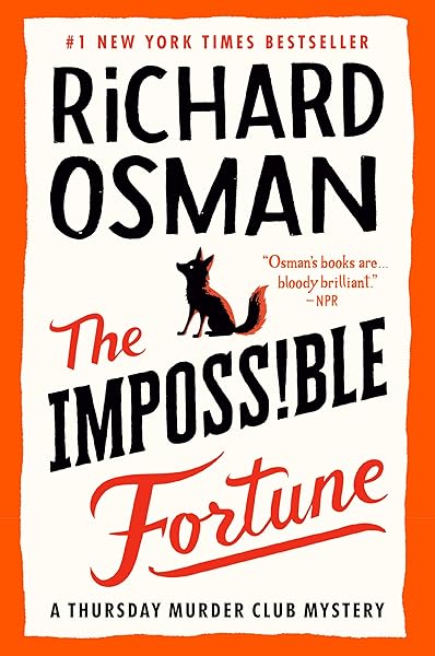
The Impossible Fortune: A Thursday Murder Club Mystery (Thursday Murder Club Mysteries Book 5)
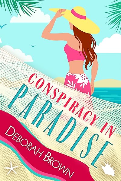
Conspiracy in Paradise (Florida Keys Mystery Series Book 36)

Galactic Green Thumbs: A Cozy, Low-Stakes, Slice-of-Life Sci-fi Adventure (No Stress Space Express Book 9)

Cozy Mystery Covers: Charm, Whimsy, and a Dash of Danger
Cozy mysteries are characterized by amateur sleuths, often in quaint settings, with no explicit violence or gore. The covers reflect this lighthearted yet intriguing tone. They typically feature vibrant, warm color palettes, often with pastels or inviting hues. Common imagery includes charming small-town scenes, baked goods, pets, coffee cups, or a subtle, non-threatening hint of a mystery, like a half-hidden clue or a slightly askew object. Typography tends to be friendly, sometimes with a hand-drawn or decorative feel. The goal is to convey comfort and community, with just enough intrigue to promise a gentle puzzle. Data shows that cozy mystery readers respond positively to covers that evoke a sense of 'escape' and 'comfort', making these visual cues essential for market success.
Thriller Covers: High Stakes, Action, and Adrenaline
Thrillers are about suspense, high stakes, and often, a race against time. Their covers are designed to evoke urgency and peril. Expect dark, dramatic color schemes (often black, red, stark white, or deep blue) and bold, impactful typography, frequently sans-serif and sometimes distressed or fractured. Imagery often features silhouetted figures, fast-moving objects, cityscapes at night, or abstract representations of danger and chaos. The composition is typically dynamic, with strong diagonal lines or a sense of movement. The aim is to communicate immediate danger and a relentless pace, signaling to readers that they're in for an intense ride. A study by Publisher's Weekly reported that thrillers with strong, iconic imagery and clear, bold titles consistently outperform those with busy or ambiguous covers.
Hardboiled & Noir Mystery Covers: Gritty Realism and Moral Ambiguity
These sub-genres delve into the darker side of human nature, often featuring cynical detectives and morally gray areas. Covers for hardboiled and noir mysteries typically employ a stark, limited color palette, often black and white, or desaturated colors with a single pop of color (like red for blood). Imagery includes shadowy figures (often wearing trench coats or fedoras), urban landscapes at night, vintage cars, or iconic objects like revolvers or whiskey glasses. Typography is often classic, strong, and sometimes slightly distressed, evoking a sense of timeless grit. The overall aesthetic is moody, atmospheric, and suggests a world where danger lurks around every corner. Think classic film noir posters translated into book cover design.
Historical Mystery Covers: Period Authenticity and Intrigue
Historical mysteries transport readers to a specific past era. Their covers must immediately establish this setting while also hinting at a puzzle. Imagery features period-appropriate clothing, architecture, objects, or landscapes. Color palettes often lean towards muted, earthy tones or rich, deep hues that reflect the era. Typography might be more ornate or traditional, echoing the styles of the period, but always maintaining readability. The challenge is to balance historical accuracy with modern appeal, ensuring the cover doesn't look dated. A subtle element of mystery, like a hidden face or a significant object, is usually incorporated to tie into the genre. For example, Regency-era mysteries would feature elegant gowns and stately homes.
Forensic & Medical Thriller Covers: Science, Suspense, and the Macabre
These mysteries often involve scientific investigation, autopsies, and a focus on the details of a crime. Covers tend to feature stark, clinical imagery: forensic tools, anatomical diagrams, microscopic views, or sterile environments. Color palettes are often cool (blues, greens, grays) or feature high contrast, sometimes with unsettling reds. Typography is typically clean, modern, and often sans-serif, conveying precision and scientific rigor. The overall impression is one of cold logic meeting chilling crime, appealing to readers who enjoy intellectual puzzles with a dark edge.
Forensic Thriller Inspiration
DIY vs. Professional: Making the Right Design Choice
As an indie author, you're faced with a critical decision: design your own cover or hire a professional? While the allure of saving money through DIY is strong, the data overwhelmingly supports professional design for market success. Industry data consistently suggests that books with professional cover design significantly outsell those with amateur covers — many authors report noticeable improvements in click-through rates and sales after upgrading their covers.
The DIY Route: When It Can Work (and When It Won't)
If you have a strong background in graphic design, access to professional-grade software (like Adobe Photoshop or Affinity Photo), and a deep understanding of current mystery cover trends, DIY might be an option. However, it's crucial to be brutally honest about your skills. A poorly designed cover, even with a brilliant story, will deter readers. Common DIY pitfalls include poor typography choices, low-resolution imagery, cluttered layouts, and a lack of genre-specific visual language. If you choose DIY, get feedback from other authors and, ideally, target readers before publishing. Remember, your cover needs to compete with professionally designed books on the same digital shelf.
Hiring a Professional: An Investment, Not an Expense
A professional book cover designer specializes in translating your book's essence into a visually appealing and market-savvy package. They understand color psychology, composition, typography, and current genre trends. They have access to commercial stock photography and fonts, ensuring high-quality visuals. The cost of a professional cover can range from $300 to $1000+, but this is an investment with a high ROI. A good designer will work with you, provide mock-ups, and offer revisions. When seeking a designer, look for portfolios that showcase experience in mystery or your specific sub-genre. Platforms like Reedsy, Fiverr, and various author forums are good starting points. Always check references and ensure their style aligns with your vision and genre expectations. This investment, alongside professional editing, is one of the most critical expenditures for indie authors aiming for success.
Avoiding Common Mystery Cover Design Pitfalls
Even with the best intentions, authors and designers can fall into common traps that undermine a cover's effectiveness. Being aware of these can save you time, money, and potential sales.
The Blurry Line: Don't Confuse Your Genre
One of the biggest mistakes is creating a cover that doesn't accurately reflect your book's genre or sub-genre. A cozy mystery with a dark, thriller-style cover will disappoint readers looking for lighthearted fare and deter those seeking genuine thrills. Similarly, a hardboiled detective novel with a whimsical, bright cover will confuse the target audience. Your cover is a promise; make sure it's an accurate one. Research the top 100 bestsellers in your specific sub-genre on platforms like Amazon to understand the prevailing visual language. Consistency with genre tropes isn't about being unoriginal; it's about signaling to the right readers that your book belongs on their digital shelf. Learn more about understanding your market.
Legibility is Non-Negotiable: Thumbnail Test
Digital storefronts display book covers as small thumbnails. If your title, author name, or key imagery isn't instantly legible and impactful at this size, your cover will fail. Before finalizing any design, shrink it down to thumbnail size (around 150x200 pixels) and view it on different devices (phone, tablet, desktop). Is the title readable? Does the core concept still come across? Many otherwise beautiful covers fail this crucial test, losing potential clicks and sales. Simplicity often wins here; a strong, clear focal point and readable typography are far more effective than a busy, intricate design that disappears at small sizes.
Clutter and Overwhelm: Less is Often More
Resist the temptation to cram too many elements onto your cover. A cluttered cover appears unprofessional and makes it difficult for the reader's eye to find a focal point. Every element should serve a purpose in communicating genre, mood, or intrigue. If an element doesn't add to the message, remove it. White space (or negative space) is your friend; it allows the important elements to breathe and stand out. Think about iconic mystery covers – they often use a single, powerful image or a minimalist design to maximum effect.
Low-Quality Imagery and Fonts: The Amateur Stamp
Using low-resolution stock photos, clip art, or free fonts that aren't licensed for commercial use immediately screams 'amateur.' Invest in high-quality imagery and professional fonts. There are many affordable stock photo sites (e.g., Depositphotos, Shutterstock, Adobe Stock) that offer excellent resources. Similarly, ensure any fonts you use are licensed for commercial book cover use. A pixelated image or a generic font can instantly diminish the perceived value of your book, regardless of the quality of your writing. Your cover is a direct reflection of your professionalism as an author.
The Power of a Strong Back Cover and Spine
While the front cover is king for digital sales, don't neglect the back cover and spine for print editions. The back cover needs a compelling book blurb, author photo (optional but recommended), and possibly testimonials. The spine, especially for thicker books, should have a clear, readable title and author name, as this is what readers see on a physical bookshelf. Consistency in branding across all parts of your cover package reinforces your author identity and professionalism.
Conclusion: Solve the Mystery of Your Cover's Success
Crafting a compelling mystery book cover design is an art and a science. It requires a deep understanding of your genre, your target audience, and the psychological impact of visual elements. By paying meticulous attention to composition, color, typography, and imagery, and by understanding the specific conventions of your mystery sub-genre, you can create a cover that not only looks professional but actively sells your book.
Remember, your cover is your book's most powerful marketing asset. Treat it with the respect it deserves, whether you're designing it yourself or, as is often recommended, investing in a professional. A well-designed mystery cover doesn't just promise a good read; it's the first clue in drawing a reader into the world you've so carefully built, ensuring your literary mystery finds its rightful audience. Now go forth and create covers that leave readers hungry for the next chapter!
Try These Ideas on Your Cover
Open the cover editor and preview fonts, colors, and layouts on your book cover.
Open Cover EditorRelated Articles
Master horror book cover design with this comprehensive guide for indie authors. Learn key tropes, color psychology, and visual elements that sell.
How AI book cover generators work, what they cost vs traditional designers, and when to use each option. Based on analysis of 2,500+ bestselling covers across 27 genres.
Unlock the secrets to crafting bestselling romance book covers. This guide covers trends, tropes, color psychology, and essential design elements for indie authors.