Book Cover Fonts by Genre: The Complete Guide (2026)
The definitive guide to book cover typography. 25 genre-specific font pairings used by professional publishers, with visual previews and licensing tips.
Why Typography Makes or Breaks Your Book Cover
Your book cover has less than two seconds to convince a reader to click. In those two seconds, typography does more work than your illustration. The wrong font signals "amateur" before the reader even processes the image beneath it.
Professional publishers spend thousands testing font pairings for each genre. Romance readers expect flowing scripts. Thriller readers expect bold condensed type. Fantasy readers expect classical serifs with weight and history. These expectations are genre conventions, not aesthetic preferences — break them and your cover looks out of place on the shelf.
We analyzed bestselling covers across 25 genres and distilled them into curated font pairings: one for the title, one for the author name. Each pairing is designed to pass the Kindle thumbnail test — readable at 200 pixels wide, the actual size shoppers see on Amazon.
Use the interactive explorer below to browse every pairing by genre. Then read on for pairing rules, fonts to avoid, and licensing for self-publishers.
Bestseller covers across genres


Font Pairings by Genre
Click a genre to see the recommended title + author font pairing, rendered on a mock cover. Each pairing is curated from professional publisher conventions and tested for readability at Amazon thumbnail size.
All 19 genre presets are available in the Dear Pantser cover editor — pick a genre, and the fonts are applied automatically.
The Last
Chapter
A. Writer
Best Fonts for Thriller Covers
Condensed all-caps for urgency and authority.
Condensed, all-caps display — Thriller / General
Geometric sans — Author / Body
Publisher examples: Jack Reacher, Harry Bosch, David Baldacci
Font Pairing Rules for Book Covers
A book cover uses exactly two fonts: one for the title, one for the author name. Here's how to pair them effectively:
Rule #1: Contrast, not conflict. Pair a decorative title font with a clean body font. Two decorative fonts fight for attention. Two plain fonts look generic. The title carries the mood; the author font stays out of the way.
2. Match the weight hierarchy. The title font should always be visually heavier than the author font. If your title font is light or thin, increase its size dramatically to maintain hierarchy.
3. Serif + sans-serif is the safest pairing. A serif title with a sans-serif author (or vice versa) creates natural contrast. Two serifs can work if they're from different families (e.g., Cinzel + Cormorant), but two sans-serifs risk looking monotone.
4. Genre before taste. Your personal favorite font doesn't matter — what matters is what readers in your genre expect to see. Romance = script. Thriller = condensed sans. Fantasy = classical serif. Breaking these conventions is possible but requires exceptional design skill.
5. Test at thumbnail size. If you can't read the title at 200px wide, change the font. This single test eliminates 90% of bad cover typography.
Romance: Script + Clean Sans
Fantasy: Classical Serif + Elegant

On Wings of Blood: A Novel (Bloodwing Academy Book 1)

Rain of Shadows and Endings (The Legacy)

A Tongue so Sweet and Deadly (The Compelling Fates Saga)

Shield of Sparrows: An Enemies-to-Lovers Epic Romantasy

We Who Will Die: An Epic Romantasy of Forbidden Love, Deadly Secrets, and Vampires in a High-Stakes Arena, Discover a Vividly Reimagined Ancient Rome (Empire of Blood Book 1)
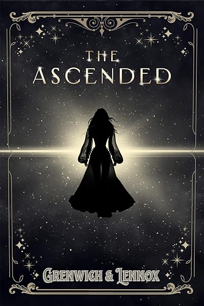
The Ascended (The Aesymarean Duet)
Fonts to Avoid on Book Covers
Some fonts are so overused or poorly designed that they instantly signal "self-published with no design budget." Avoid these:
Comic Sans. The most universally mocked typeface in design. Even on children's books, it looks unprofessional — Fredoka One achieves the same playfulness with more polish.
Papyrus. Thanks to Avatar and Saturday Night Live, Papyrus is now a punchline. Cinzel or EB Garamond convey the same ancient feeling without the baggage.
Times New Roman. It's a body text font, not a display font. Using it for a book title says "I typed this in Microsoft Word and exported it."
Impact. A 1960s headline font that's been the default "bold" choice for decades. It's the font of memes, not books. Use Anton or Bebas Neue instead.
Brush Script. A fake-handwriting font that looks dated and insincere. For romance, use Great Vibes or Dancing Script — real calligraphic fonts with character.
Any font with "grunge" in the name. Distressed fonts looked edgy in 2005. Today they look like a band poster from a suburban garage. For texture, use Special Elite (typewriter) or Permanent Marker (hand-drawn).
Thriller covers: bold condensed type done right


The Kindle Thumbnail Test
Amazon displays book covers at approximately 200 pixels wide in search results and category pages. This is the size that determines whether a reader clicks — not the full-resolution cover.
Quick test: Resize your cover to 200×300 pixels. If you can't read the title clearly, the font is too thin, too decorative, or too small.
Check letter spacing. Scripts and decorative fonts often have letters that merge at small sizes. If any word becomes an illegible blob, it fails the test.
Check contrast. White text on a light background (or dark text on a dark image) disappears at thumbnail size. You need at least 4.5:1 contrast ratio.
The author name is optional at thumbnail size. Most readers don't read the author name in search results unless they already know the author. Size the author name for readability, but don't sacrifice title size to accommodate it.
Every font pairing in this guide has been selected to pass the Kindle thumbnail test with standard sizing.
Font Licensing for Self-Publishers
Using a font on a book cover is a commercial use. Here's what you need to know about licensing:
Google Fonts = free for everything. All Google Fonts are released under the SIL Open Font License. You can use them on covers, in print, on merchandise — no attribution required, no fees, ever. Most fonts in this guide are Google Fonts.
Free ≠ commercially free. Many fonts on DaFont, FontSquirrel, and Creative Market are "free for personal use" but require a commercial license for book covers. Always check the license before publishing.
Adobe Fonts require an active subscription. If you cancel Creative Cloud, you lose the right to use Adobe Fonts on new projects. For book covers with a long shelf life, prefer fonts you own outright.
Custom/premium fonts are worth it — sometimes. If you're publishing a 10-book series, a $50 font license is trivial. For a single book, Google Fonts and other free commercial-use fonts are more than sufficient.
Embedding in ebooks. If you embed a font inside an EPUB file, you need a license that explicitly permits embedding. Cover images don't embed fonts (they're rasterized), so cover use and ebook interior use have different licensing requirements.
All 38 fonts available in the Dear Pantser cover editor are cleared for commercial use on book covers.
Try These Ideas on Your Cover
Open the cover editor and preview fonts, colors, and layouts on your book cover.
Open Cover EditorRelated Articles
The biggest book cover design trends in 2026 — illustrated covers, bold typography, dark aesthetics, pastel rom-com, and more. Data from 2,500+ bestsellers across 27 genres.
How color drives book purchase decisions — backed by bestseller data. Genre-specific color palettes, common mistakes, and the psychology behind why certain colors sell.
How AI book cover generators work, what they cost vs traditional designers, and when to use each option. Based on analysis of 2,500+ bestselling covers across 27 genres.